
What's causing all these logos to look the same? https://t.co/DgnNfOV20v
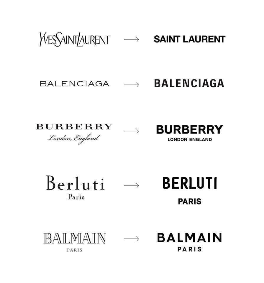
My best guess comes down to two factors: software and the Internet.
1) Software: Designers are using the same tools, which exert the same unconscious forces on their creative process.
2) The Internet: Aesthetic diversity is bound to fall in such a hyper-connected world.
Something to factor into your answer: The homogenization doesn't end with logos. It's happening to phone booths, doorbells, street poles, and bookshelves too.
(h/t @culturaltutor) https://t.co/5cqBiA2GEb


Two interesting responses:
• "This is what happens when the creative dept is overrun by the marketing dept. Being data driven is the death of art." — @cfcreative_
• "All businesses are online now and sans serif is among the easiest font set to read online." — @CartuneNetwerk
@cfcreative_ @CartuneNetwerk Though we've never had so many options, we all trust the same curators to make buying decisions for us. Sometimes, it’s Wirecutter. Sometimes, it’s the mass-scale department stores that homogenize the world while advertising the illusion of choice.
@SimonSarris explains it well. https://t.co/bUp2RiM9PS

The homogenization of tech logos. https://t.co/LWIzIVwUDG

How much of these homogenization trends come from trying to quantify beauty?
Robert Pirsig argued that quality can't be defined because it transcends language when he wrote: “When analytic thought, the knife, is applied to experience, something is always killed in the process.”
As a society, it’s as if we’ve read too many blog posts about the 80/20 rule. When you strip away too much of the non-essential, you lose the kind of craftsmanship that endows an object with soul and makes life feel meaningful.
Here's my essay on this.
https://perell.com/essay/the-microwave-economy/
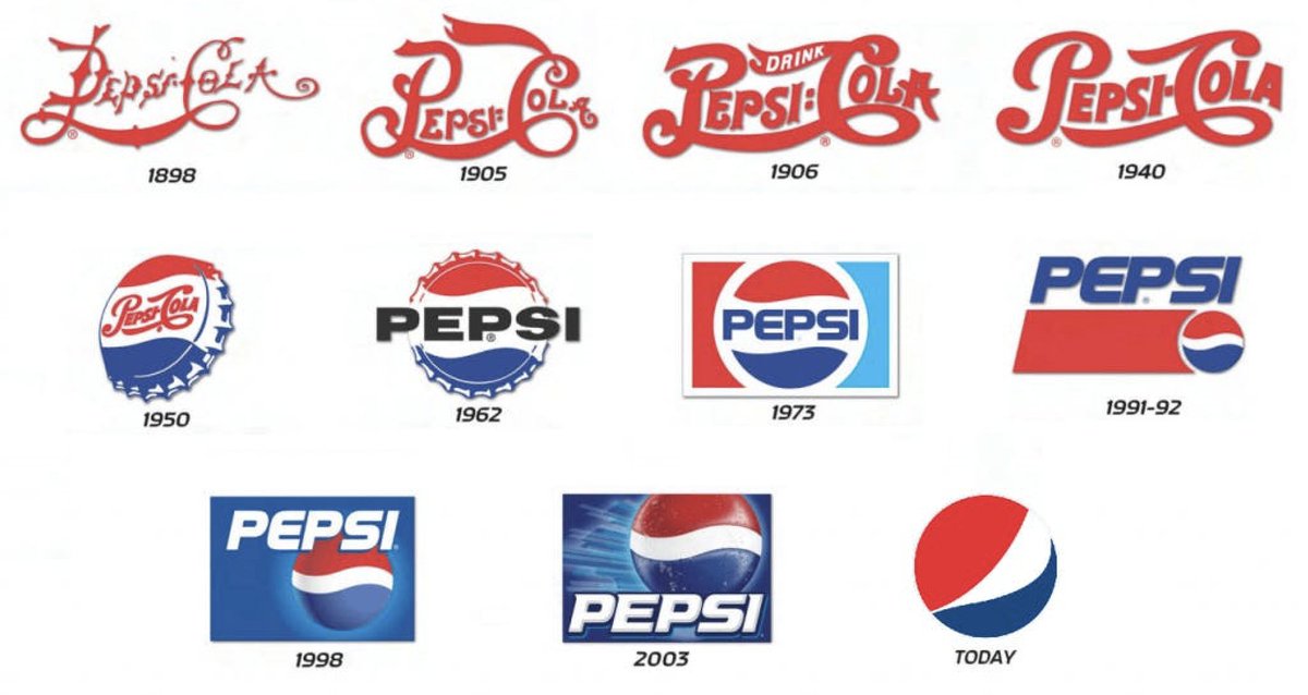
Look at how Pepsi's logo has evolved. The brand identity has become flat, bland, sterile, timid and unimaginative.
Maybe globalization is to blame. The more you scale, the more you need to appeal to different kinds of people, which sucks the personality out of what you're doing. https://t.co/GYU47VxhuR
Seinfeld has a bit about how people wear the same clothes in every movie about the future.
(h/t @ChrisCuilla) https://t.co/sT9ZMcE1KY
Writers aren't immune to these trends. It seems like every non-fiction book follows the same blueprint of simple words, short sentences, and research papers to justify every obvious intuition.
And yeah, it's efficient, but where are the unhinged Hunter S. Thompsons of the world?
MFA programs might be homogenizing novels.
@ErikpHoel has written: "Workshop-trained writers are often, not always, but often, intrinsically defensive. This single fact explains almost all defining features of contemporary literature."
https://erikhoel.substack.com/p/how-the-mfa-swallowed-literature https://t.co/wU6SpjpHFN


Have you seen these drawings?
The style is called "Corporate Memphis" and it's everywhere now. It was originally designed for Facebook. The figures are flat, minimal, abstract, and geometric because they're non-representational, which makes them feel universal. https://t.co/n0CuDPwfns


Architecture follows a similar pattern.
I keep seeing the same kinds of modern houses that look like they’ve been copied & pasted by a slapdash architect. Professional architects might call these homes “minimalist,” but I think they're just soulless copycats of each other. https://t.co/BOJh4AVjz8


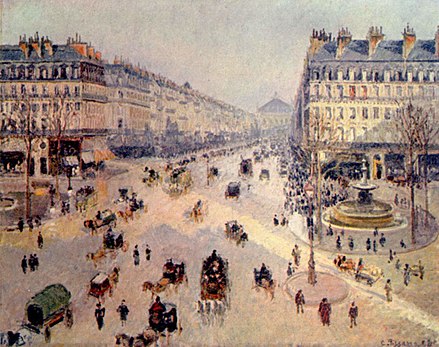
Counterpoint: Many of the places we think are most beautiful are incredibly homogenous. Think of Paris and it's pretty Haussmann style apartment buildings that cover the entire city, simply because Napoleon III said so.
The difference is how global these design trends are now. https://t.co/k9SzZOi4Qu


If you liked this thread, you’ll like my Friday Finds newsletter too.
Each week, I share my five favorite articles, many of which are related to the homogenization of design.
Subscribe below.
https://perell.com/friday-finds-links/
This is the best article I’ve seen about the logo phenomenon.
“One reason for the sans serif logo trend is readability. Especially on mobile, but everywhere else as well: from huge billboards to tiny footer links at the bottom of mobile websites.”
https://velvetshark.com/articles/why-do-brands-change-their-logos-and-look-like-everyone-else
Even at the world’s top institutions, design is losing its soul. https://t.co/nNtlt3FXtM
